
A new year is here, which means it’s time to toss out all our old and bad habits. Right?
Of course, doing away with bad design habits is always a good thing.
Inefficient processes and outdated techniques should always be replaced once you have a smarter way of executing them. However, doing away with the old? Well, if 2018’s Web design trends tell us anything, it’s that “old” design trends from 2017 aren’t going as far away as we might think. In fact, much of what I’m about to share is going to look quite familiar, just with a more modern twist.
Now, although many of the Web design trends in 2018 are similar to ones you’ve been using the last couple years, that doesn’t mean it’s time to kick back and relax. The Web design trends of 2018 have evolved a great deal as the technologies we use to execute them and our knowledge of what users want have been further refined.
So, let’s take a closer look at what each one entails as well as some real-world examples that demonstrate each Web design trend nicely.
9 Web Design Trends It’s Time to Master in 2018
The following Web design trends have already started to leave their impression on the Web, which is why there are already some cool examples of these trends in action. Keep reading to discover more about what’s behind each of these design trends and to find out why these may be beneficial to use in your own WordPress Web designs this year.
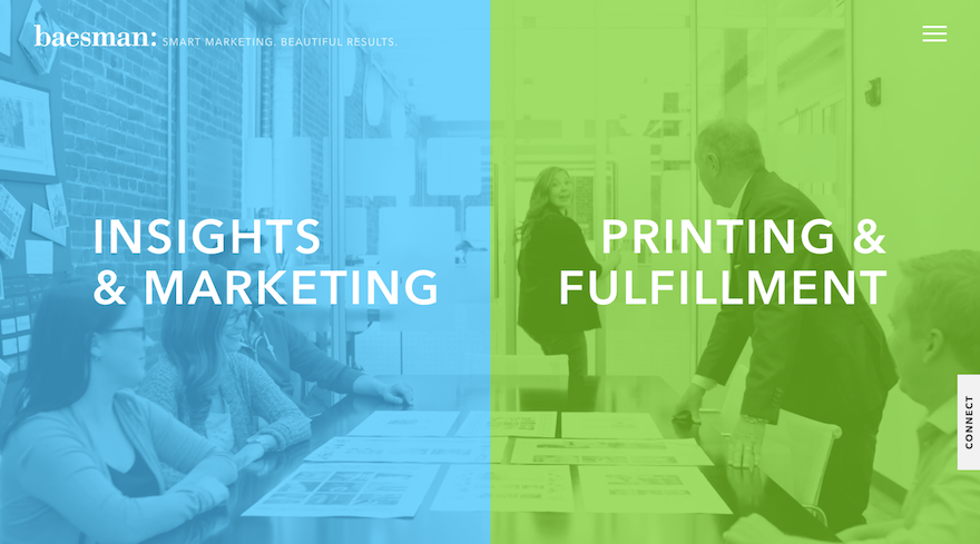
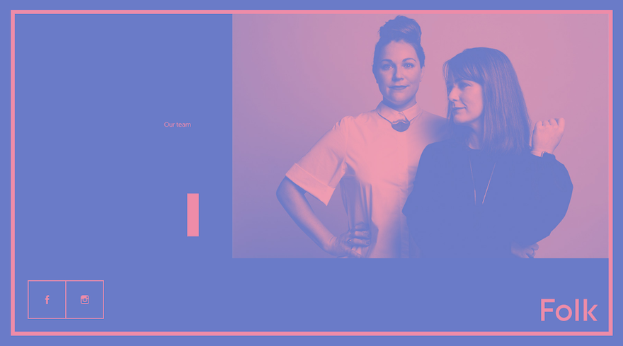
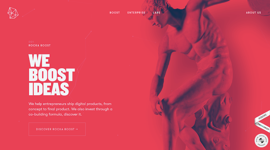
1. Vibrant Color Schemes
When Google came out with Material Design in 2014, it pushed the boundaries of what Web designers had been willing to do up to that point, especially when it came to color. Thanks to the success we’ve seen with Material Design and what it’s enabled designers to do with bright colors in a controlled setting, 2018 is giving designers the thumbs-up to experiment with it even further.
Vibrant color schemes are perhaps the tamest part of this trend as we’re also going to see more experimentation with double exposure, gradients, and photo saturation.
Baesman
Folk Strategies
Rocka
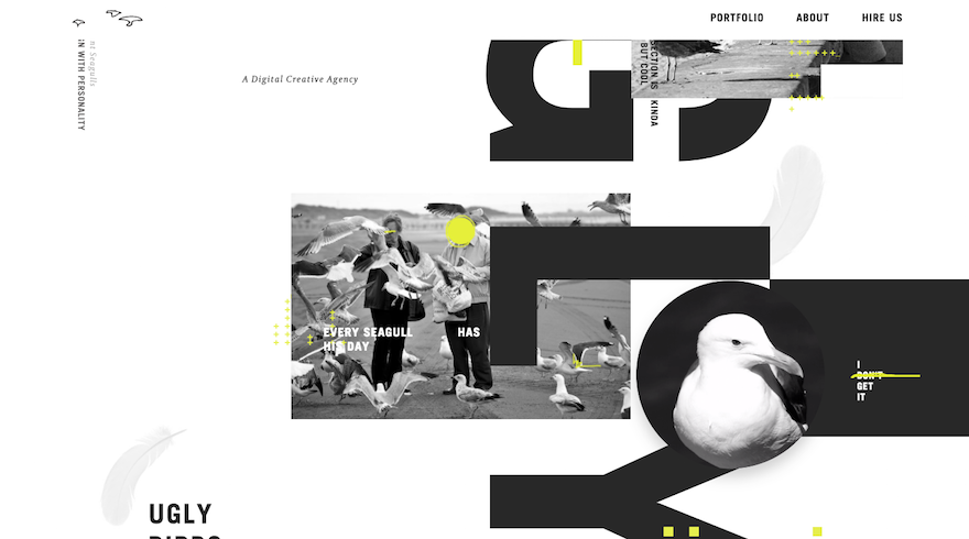
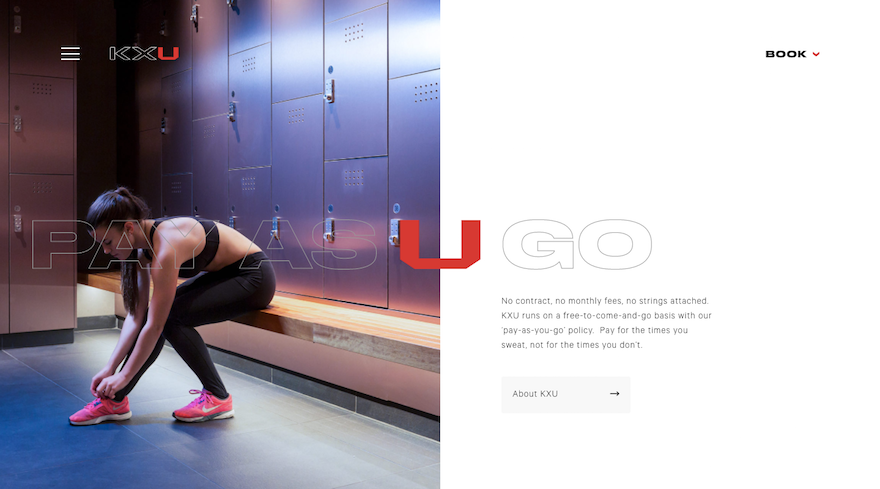
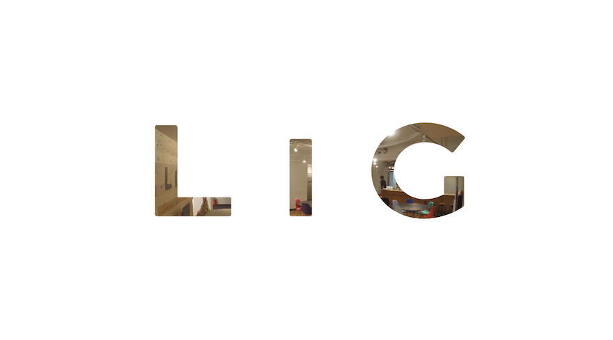
2. Rebellious Typography Choices
First off, let’s be clear that this one isn’t about anything other than header text. The rules established regarding the readability of standard paragraph text are ones that should never be broken. That said, header text–especially on the top of a home page–is a different story.
In 2018, we’re going to see a major shake-up in how this header text is styled. It’s going to be:
- Bolder
- Oddly spaced
- Transparent
- Weirdly misshapen
- Haphazardly placed
- And who knows what other techniques designers will come up
Needless to say, Web designers are going to have a lot of fun pushing the boundaries of text this year.
Elegant Seagulls
KXU
LIG Works
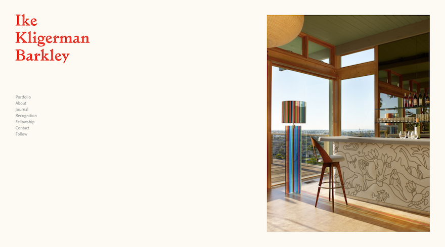
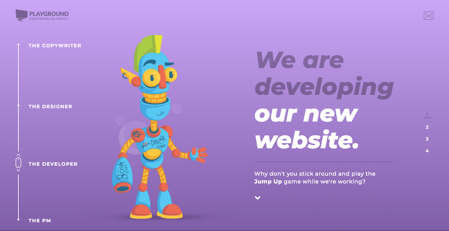
3. Asymmetry
Users have been trained well to understand how Websites work:
- Use the top navigation to find other pages.
- Scroll down to read more.
- Click the flat, colorful buttons for more information.
Now that they’ve got the basic principles down, designers are free to experiment with layouts and grids, using unexpected changes and asymmetrical balance as a way to surprise and delight users along their journey.
Ike Kligerman Barkley
Leen Heyne
Playground Creative Digital Agency
4. Experimental Video and Animation
Another way Web designers will be shaking up design is with video and animation, though not in the ways we’ve traditionally seen it used. While there will always be a need for explainer videos and scroll-triggered animations, 2018 will bring with it more experimental uses of video in the form of cinemagraphs, particle backgrounds, virtual or augmented realities, and even animated thumbnail images.
Ann Street Studio Amangani Example
Video Player
00:00
00:15
Huffington Post Highline
Video Player
00:00
00:17
Nissan Micra
Video Player
00:00
00:26
5. Micro Interactions
Animation doesn’t always have to be big and bold. This is especially the case now as colors and typefaces become brasher and rebel against more traditional and safer norms.
Instead, what we’re going to see more of in 2018 are micro interactions. This means designers can use animation as a sort of signal or reward for visitors that properly engage with their Websites. Rather than continually throw movement at visitors, this subtler touch will surprise and delight visitors as they engage with less obvious elements on the site.
KBS Agency
Video Player
00:00
00:08
Untold Digital
Zero NYC
Video Player
00:00
00:12
6. Sticky Elements
As you can see, 2018 will test the waters in terms of how much the users’ experience can be disrupted with shocking amounts of color, unexpected movement, and even typography that requires them to work a little more than usual. That’s why it’s nice to see that not all Web design trends for this year will be so disruptive.
Take the sticky elements, for instance. Sticky navigation and hello bars are not new concepts in Web design. That said, designers wisely recognize the benefits in making certain elements “stick” to the sides of a Website in order to reduce friction while sharing messages in an unobtrusive way with visitors.
CoSchedule
Elegant Themes
Wishpond
7. Hand-Drawn Elements
In the not-too-long ago days of early Web design, stock images were the hot thing. They were easy to find and didn’t require you to do much work other than search, purchase, and download. Then there was custom photography. It gave designers a chance to put a personal spin on a Website’s design.
Obviously, neither of those design options will go away as stock and custom photography still have their place. However, for designers that want to put a creative spin on a Website and make it uniquely their own, you can utilize the hand-drawn trend. This, of course, doesn’t mean you need to illustrate a Website totally from-scratch, but you can infuse hand-drawn elements like images, text, and even highlighting within it.
Basecamp
co:
Mellow Mushroom
8. Fluid Shapes
If you want to know where the fluid shape design trend comes from, all you have to do is look back at the geometric-focused designs that dominated Websites the last few years. Basically, this trend says that geometry rules, but it needs to not be so severe all the time. Oh yeah, and it’s okay to give your shapes some depth and movement if you want, too.
So, basically, moving into 2018, you’ll want to round some of those sharp edges on your Websites. And bring back the 3D layering of Material Design.
Andy Wei
Video Player
00:00
00:15
Bubblewits
Fyne Digital Creative
9. Mobile Prioritization
Finally, there’s the prioritization of the mobile experience. Mobile-friendly Websites, responsive Web design… with these techniques mastered, it makes sense that Google is just about ready to take this up a notch with mobile-first indexing.
This means that sites will no longer be primarily ranked on the desktop experience. In the near future, Google will use the mobile version of the Website for determining rank. And, as the mobile experience takes an even greater priority in your Web design process, you’ll find other mobile-first initiatives, techniques, and tools making their way towards you. In 2018, specifically, you can expect to see more Websites relying on SVGs (instead of JPGs or PNGs) as well as more Websites going through Google AMP.
Using These Trends in 2018
One of the great things about Web design is that it’s a constantly evolving thing. While each of the Web design trends of 2018 will require a slight reconfiguration of how you design WordPress sites, they shouldn’t require that you learn a completely new technique. It’s simply a matter of rewiring your brain to look at design a little differently this year.