
It’s a new year – time for a fresh new start.
For many people, that means it’s finally time to give that tired, old, difficult-to-update Website a facelift. But where do you start?
The first step is to analyze your conversion goals. Oftentimes, they’re not as good as they could be, simply because the site itself is too cumbersome or confusing for visitors to use. With a conversion-focused redesign in mind, here’s what to look at:
“Flat” User Interface
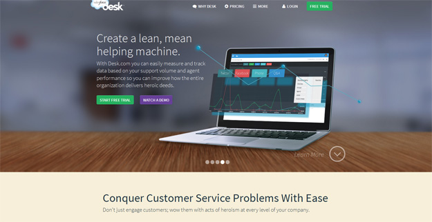
Desk.com is an example of a flat design – simple, large and easy to interact with
Flat design has been popularized by Windows 8 and its touch-screen capabilities and is praised by designers for its ability to create an intuitive, easy-to-navigate experience for users. Large, crystal-clear “hero shots” of your product or service, coupled with an attention-getting, direct headline and easy to spot call-to-action buttons make taking action on a page straightforward and simple.
If you’re looking for a little inspiration to get started, there are plenty of free and low-cost interface kits for designers that come in a variety of colors and styles.
Responsive Design
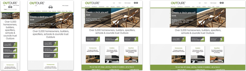
Outdure’s responsive design modifies itself depending on the device you’re browsing with
It has been shouted from the rooftops since 2012 –responsive design is the way to go. Not only do Google and your mobile device users love it, but it will save you money on development costs in the long run, since developers only have to create one framework for multiple devices. That makes your design virtually future-proof as handheld tablets and smartphones become increasingly intertwined in our daily lives.
Create a “Scrolling Story”
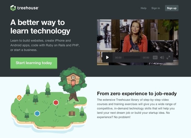
Treehouse, a site designed to teach technology, tells a story as you scroll
Content-wise, there’s an ongoing push to compact and simplify. Forget the grandiose descriptions and whack-a-mole portfolios, content in the new year is all about putting your benefits and features on the table, and letting the user decide. As they scroll, you share new tidbits that keep them with their finger on the pulse of the scroll-wheel.
Every sentence, and every word has a job to do. Cut out any excess fluff that doesn’t somehow lend itself to your original paragraph thought – your readers won’t believe it anyway.
Parallax Scrolling
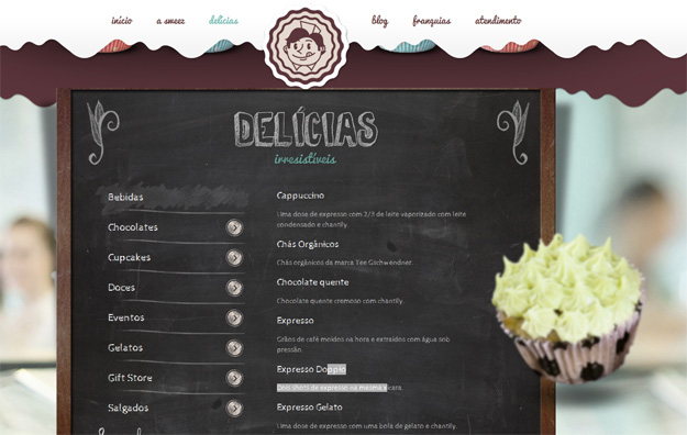
Sweez, a Brazilian bake shop, employs parallax scrolling to great effect on their site
Parallax scrolling is one of those things you either love or hate – love it, because of the unique 3D effect it can create by superimposing two images to create a sense of depth. Hate it, because if used purely for the “shiny object” factor, it can feel gimmicky and useless.
But is it user friendly? At this point, designers are still having to convince users to continue scrolling for maximum effect via little mouse icons and arrows. I believe if it’s not completely intuitive – it’s just eye candy. In the words of the immortal Steve Krug, “don’t make me think.”
Social Validation
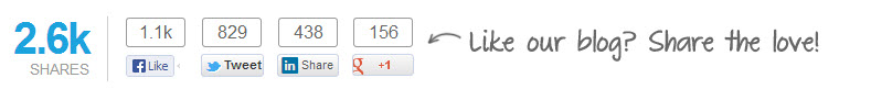
2014 is moving beyond pure “social proof” and into “social validation”. What’s the difference? Social proof is assuming the actions of the group in order to mimic what’s believed as the “correct behavior”. Social validation takes this a step further and gives users a visual “guidepost” – that if 1,000 people shared this article, it must be good.
These days, social sharing has gone beyond “like our post”. People know what likes are, and how to give them – now, the real measure of an article’s worth is in the numbers.
There are plenty of plugins available to help you add this functionality – such as AddThis and ShareThis. A simple social sharing plugin is also available for WordPress.
Simple Landing Pages
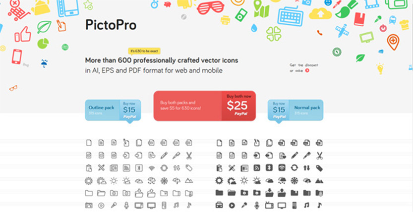
PictoPro’s landing page displays a handful of its beautiful vector icons along with three buy buttons.
Landing pages aren’t meant to be an extension of your home page. Simpler pages always win out over their more cluttered counterparts and no example proves that more than PictoPro. Their landing page states just the facts that visitors want to know (how many icons are there? What formats are they in?) presents a selection of buy now options and a showcase of its icons. That’s it. The end.
All landing pages should strive to be this simple – tell the user what you have to offer, what it costs and how they can get it. Expect landing pages to continue on this path of simplicity and straightforward action well into 2014 and beyond.
Pick Yourself Up By Your Bootstraps
Twitter’s Bootstrap framework has grown to become an easy and fast way to launch responsive websites
Although Twitter’s Bootstrap framework was made open source in 2012, it has continued to surge in popularity and ease-of-use. Because it focuses on “mobile-first” design standards, there’s never any question if a site built with it is fully optimized to take advantage of the smartphone and tablet landscape. Pixel-perfect optimization is built in to every line of code.
Many Bootstrap themes also take advantage of parallax scrolling – so you get the best of both worlds!
Your 2014 Website Redesign Checklist
Ready to get started with a modern new look? Let’s go over the key points:
Keep layouts simple – Clean, crisp pictures and vivid call-to-action buttons with a headline that succinctly states exactly what you’re offering. Flat designs work exceptionally well together with responsive frameworks – a win-win for designers and marketers. Download one of many interface kits and get creative!
Content should tell a story – Lead visitors along as they scroll to share the benefits of your product or service in a way that’s meaningful to them. Show them what kind of results they can expect and how it works. There are several parallax themes and templates you can use as a springboard for your own ideas.
Leverage trends intelligently – Only use new features like parallax scrolling where and when it makes sense when paired with your overall conversion goals. Resist the urge to embrace a trend purely for the shiny-objectness of it.
Maximize social validation – Encourage users to like, tweet and become engaged with your content by making it one-click simple to share. The more shares you get, the more likely people will continue to share it based on simple numbers alone.
Create efficient, simple designs – In 2014 and beyond, you can expect designs to maximize the use of space, typography and mobile optimization right out of the box. Simple landing pages designed to minimize scrolling and user-friendly frameworks will continue to amaze us with their potential.