
Aaah, the good old days.
It was a much simpler time… Websites were straight HTML. Screen sizes were about the same size and ratio. 640 x 480 at 72 dpi.
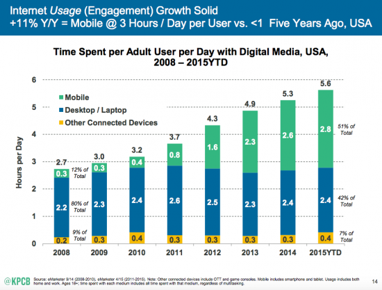
Wow, have things changed, and for the better. It has caused me pain and angst seeing perfectly good Websites become obsolete before my eyes. With the introduction of smart phones, tablets, and wide screen displays on both the laptop and desktop, the challenge is to make sure your Website looks good on them all. While not an easy task… it is a necessity to say the least. Because now more than 51% of activity online is from smart phones and tablets, just seven years ago it was 12%.
So now we at least know the challenge we are dealing with. Make your Website look good on all devices at the same time. And here’s the kicker. Now Google will derank your site (push it down in the search results) if it is not mobile friendly. They are doing this because they now how much traffic is from mobile devices and they want to make sure the experience for the end user is the best it can be.