This a good time to look at what the possible trends could be for 2015.
This year has produced some great website designs that have made heads turn and ‘wowed’ people.
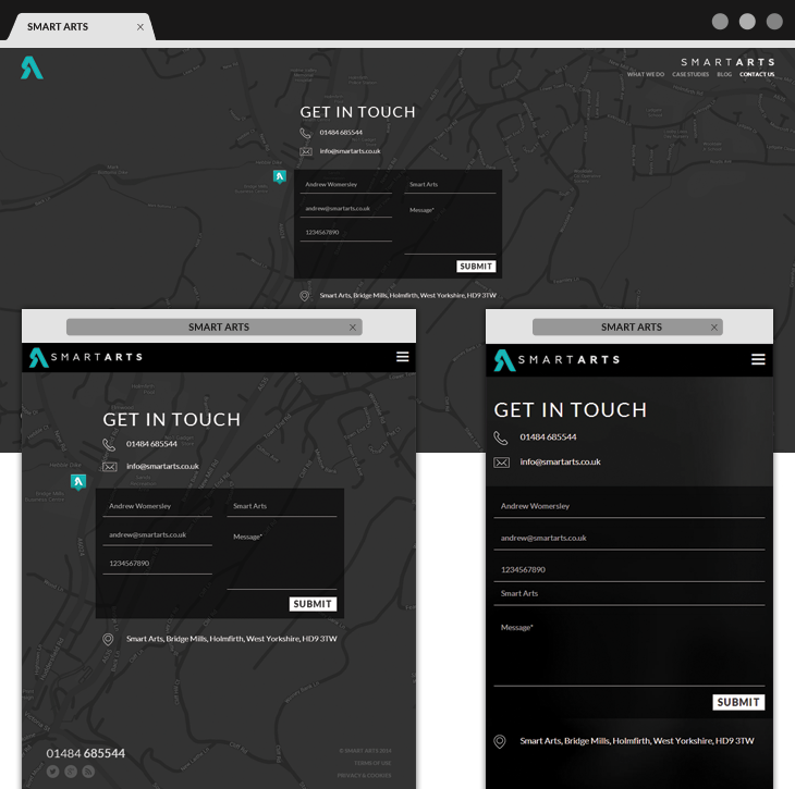
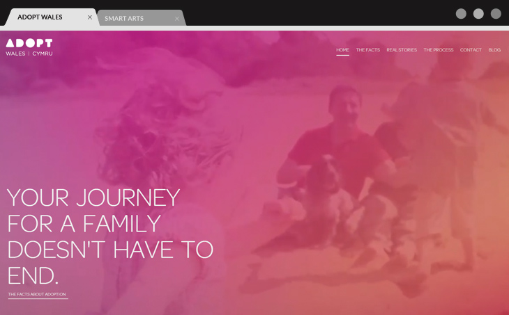
[source: SmartArts] Looking ahead is never a bad idea, especially for those businesses considering a web re-design to launch the new year in style.
Responsive design here to stay
People who aren’t designing for a mobile audience are in essence working against themselves. The number of people using mobile devices to access the web is increasing monthly, and mobile will soon be the most common way to visit websites, especially in the B2C market.
Having a website that can be easily viewed on a phone or a tablet, along with traditional desktops, is a must. This is especially true for businesses that rely heavily on mobile technologies to make their service or product more accessible to customers. Consumers want products or services to be accessible at all times of the day and on the go.
Responsive designs will continue to evolve and adapt as new technology is released in the coming year or years, such as smart watches, smart TVs, smart house devices, etc.
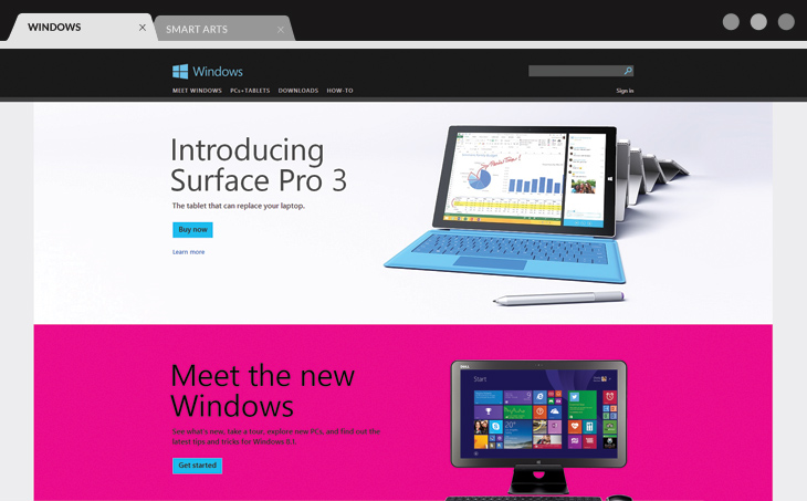
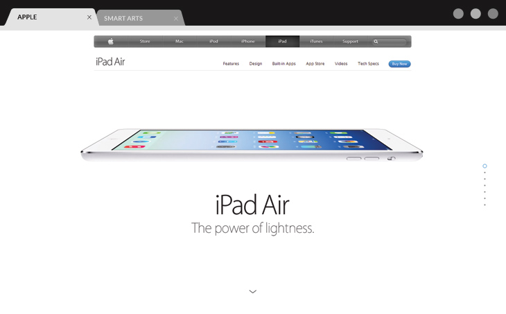
Flat design will still be around in 2015
Over the past year people have had mixed feelings on the Windows 8 design, but one thing is for certain – it did set the foundation of what the design world today refers to as ‘flat’ design. In case you haven’t heard of it, flat design is simple and elegant with clean lines and elements that appear smooth and minimalistic on screen, with the use of vibrant colours to help bring life to the website. A major advantage of flat design is the website is very quick to load.
Typography is king
Are people still using Times New Roman? If you ask any graphic designer working on print they will tell you that having the right font is key to any design project, as not picking the right font can make the whole design look wrong.
With the emphasis on content to gain better search results, using rich typography is the new medium of style and sophistication that can be more easily added to websites.
Before people would stick to using Times New Roman or Arial for both print and web as it would be the cheapest option. High quality fonts for the web are now available at a reasonable price or even free if you use Google fonts. Most print fonts are available for web use, which is good for business owners as they can launch a marketing campaign for print and online with matching fonts and show brand consistency.
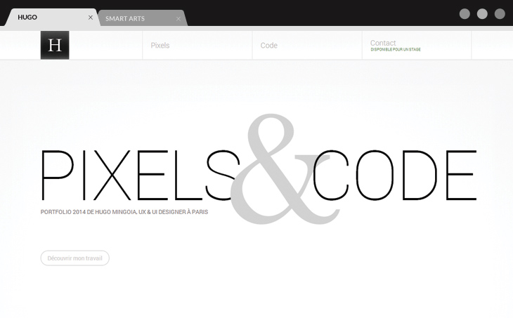
The bigger the images the better
Using pictures has always been a fantastic way to express ideas online, as you can see from the great success of Pinterest and Instagram. An excellent way to use powerful big imagery is to use text overlay as a way to quickly market ideas to users.
When considering responsive users, a picture is easier to digest than squinting at text. For mobile users a great powerful image is worth a thousand words – but do keep in mind that content is as important, if not more important, than images for both informative and SEO reasons.
More scrolling
‘Scrolling sites’ or parallax sites as they are known can be very pleasing aesthetically. Traditionally, sites with multiple pages are nice to work with because you have more SEO power, but while it is more difficult to optimise a parallax site for search, it can be done.
Referring back to my first point about the importance of mobile, it is far more user friendly on a smartphone or tablet to scroll than have to click around and wait for pages to load. More businesses who will be targeting mainly mobile users will be picking up the single page scroll to allow easier interaction.
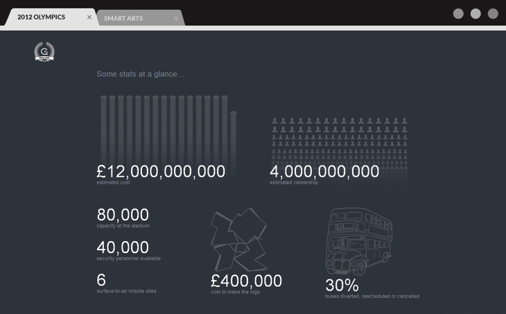
A mix of everything – Infographics
Infographics truly are eye candy when it comes to design. The best thing about infographics is that they allow marketers to display effectively a whole lot of information in one space, using a combination of imagery, rich typography, bold colour schemes, brand and a touch of personality.
The primary goal of infographics is as simple as it sounds – to provide potential customers with a user-friendly interactive interface that is designed to keep them hooked for longer. But it does take some science, along with design, to be able to construct a compelling infographic.
As you can see, a lot of the trends are based on the needs of the ever-growing mobile web user market. Consumers will always want to experience something that is functional and fast, while also being visually pleasing.
Companies who don’t consider the mobile web user market are only holding their product back from reaching out to the mass market. Not considering mobile will affect the number of people who ultimately use your service or would have maybe considered using it.
For those thinking about re-designing their company website in the near future, consider our web design trends for 2015 as a good blueprint for success, and for being ahead of the competition.